This is one reason why I love maps – they convey huge amounts of information efficiently. Take, for example, the following maps:
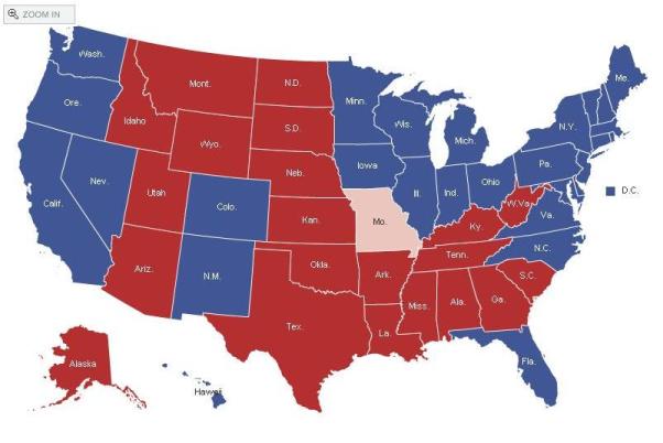
The first is fairly self-explanatory, and it appears to show clear regional divides within America in regard to who should be president.
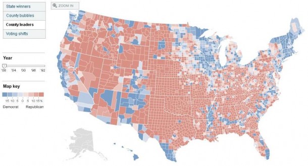
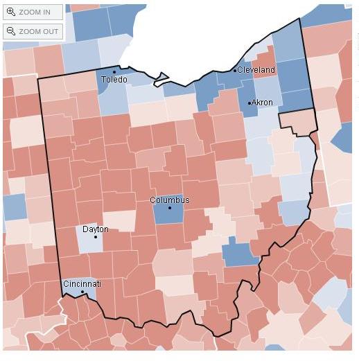
This map shows results by county, and a much more interesting picture exists at this level of detail. For example, Ohio and Pennsylvania went for Obama, but each state shows far more red counties than blue counties. So it seems safe to infer that the majority of people in rural, low-density areas vote Republican while those in urban, high-density areas vote Democratic. Not surprising, but there are strange exceptions, like Athens County, OH (the next picture – lone dark blue county in the lower right), which went for Obama 66-31%, while surrounding counties were almost equally lopsided in favor of McCain. Why? Less than 30,000 votes were cast in Athens county, so is Obama’s win there really explained by the high-density argument? My lack of knowledge of Ohio is probably hurting me here, but I’m very curious why Athens, OH voted so differently from its neighbors.
Parting shot for the county map: in Nevada Obama won Reno and Las Vegas to take the state, and got dominated in nearly every other county. Residents of Eureka County, NV cast about 750 votes, and 75% of them went for McCain.
Second parting shot: McCain took dense, urban Orange County, CA 51-47% with over 900,000 votes cast.
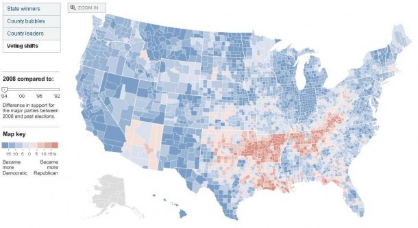
The final map is one showing voting shifts between the 2004 Presidential race and this year.
Most of the country, even red states, voted much more blue this year than they did in 2004. Somewhat concerningly, almost the entire states of Tennessee and Arkansas, and large portions of Kentucky, Oklahoma, and Louisiana voted much more red this year than previously. Some counties (such as Pushmataha, OK) that voted 60-40% for Bush in 2004 voted 72-28% for McCain in 2008. Even all of the parishes around New Orleans (except Orleans parish) saw an increase in the margin of victory for McCain. Say what? Are these new residents who missed out on Katrina? Or are these people so fed up with the lack of federal government response that they can’t stomach voting for a candidate (Obama) who seems to represent bigger government?
(To investigate further, check out this site)


There is a simple explanation for Athens County, OH: Ohio University. I went to graduate school there and I can tell you it is a very liberal pocket of the state with a huge number of young voters.
-Bradley
Wow, You’ve become quite a writer. You exhibit a broad base of knowledge. Your points are clear and concise. I’m excited to see this talent blossom in your life.
Love, DAD